Monday, 31 May 2010

Couchitecture

Check out these wonderful posts about cardboard architecture, which consisted of an entertaining/comedic analysis on "cardboard fort architecture". The critics, who make up an American architectural practice called Build LLC, were fascinated by this underrated design methodology that goes back to every architect's basic instinct, back to their childhood design and build urges, which "helped us figure out the ABCs of design and construction... that helped us get where we are today. " It sort of reminded me of the projects we used to get as first year architecture students, projects like creating an architectural dish or a 1 pound tower.

These posts were very entertaining, but an earlier series on what they called "couch cushion architecture" really made my day. Just like the cardboard series, this couch series examines a more primal example than cardboard boxes as a material, and that is interior furniture. The analysis of each project consisted of light commentary and a mark on each project. Here are some of the submissions along with their evaluation as given by the critics:

A brilliant synergy between the weighted foundation and the light tensile structure, this project impressed us with its attenuation of structure and bright interior spaces. The courtyard and formal entry are also well thought-out and provide a clear means of way-finding.

Grade A+


The A-frame’s sound structural properties and ease of construction have long since proven their architectural merits. We applaud the use of red shag carpet as a departure from what would otherwise be a mere pedestrian form.

Grade: B+


This whimsical project draws inspiration from the classic Tuscan stone towers of Italy; where a taller tower symbolized an owner’s power and prosperity over neighboring structures. Unfortunately the design falls short of greatness with its lackadaisical cushion placement and poor choice of plaid.

Grade: C


While typically the stacked foundation technique leads to a stable and impressive base, this particular application seems dubious. Fraught with apparent labor strikes the project is rumored to have developed irreconcilable technical inadequacies and unresolved scheduling conflicts.

Grade: D-


Good God gentlemen, you’re a mess! You need walls, you need a roof. Get to work man!

Grade: F

Friday, 28 May 2010

Sea Orbiter

It is often said that we know more about outer space than we know about the ocean, which makes up around 71% of our planet. So it is natural to hear that the technology for exploring the ocean base, which goes as deep as 11km, is as advanced as the technology used for outer space expeditions, if not more.

Recently, French architect Jacques Rougerie have designed a prototype called the Sea Orbiter, which should help scientists in exploring our oceans. This incredible project have garnered the backing of several international agencies including NASA. The Sea Orbiter is a huge floating vessel, with two thirds of this 51m high sail shaped structure submerged under water, allowing continuous underwater observation, twenty-four hours a day.


Sunday, 16 May 2010

World Cup


FIFA World Cup Trophy.

It hasn't been the best of times in my life lately, with too many distractions keeping me away from taking care of this blog. But as the most watched and anticipated sporting event is knocking on our doors, I felt like I had to say something about it. Well, at least from an artistic point of view.


The world cup trophy is perhaps the most beautiful sports award I have ever seen. Perhaps even the most beautiful award at all. Maybe even the most amazing sculptural piece ever made. Unlike its predecessor, also known as the Jules Rimet Trophy, the FIFA World Cup Trophy have really stood the test of time in terms of its aesthetics, and perhaps even contributed in increasing the popularity and possibly even the status of the World Cup as the ultimate sporting event across the world. Being a sports fan generally and football particularly, nothing have ever captured me as much as the beauty of this trophy.

This significant sculptural piece was designed by Silvio Gazzaniga, who hails -as one might predict- from a nation with a strong passion to the arts, football, fashion, and even though its irrelevant, food. The Italian sculptor from Milan designed the concept and collaborated with a Milanese trophy and medal manufacturer, GDE Bertoni, in its production and are still in charge of its maintenance in behalf of FIFA. The company's other notable trophies include the UEFA champions league, UEFA cup, UEFA super cup as well as many other trophies, perhaps most notable for its beauty is the new Arabian Gulf Cup.

Where the older trophy was a representation of Nike, the Greek goddess of victory, this trophy represents the "joy and greatness of the athlete in the moment of triumph". According to the artist, the shapes of two athletes are reproduced through lines that rise spirally from the base to open on top to contain the world, outlined in an amazing dynamic tension of the body of the sculpture, which symbolizes the athletes effort and exertion while expressing harmony, simplicity and peace.


The trophy at 1974 when it was first awarded.

Friday, 30 April 2010

Saudi Arabia Pavilion for Shanghai Expo 2010

I haven't been a good blogger as of late. But when I saw the design for Saudi Arabia's pavilion for Shanghai expo in Arch Daily blog and the comments that followed, I started writing my comment until I noticed that it was getting a bit longer than I expected. So I decided to drop everything else and post my comment here on this blog and simply post the link to it.


The Saudi Arabia Pavilion


I am from Bahrain, not Saudi Arabia, but still from the same Arabian Gulf (or Persian Gulf as the West like to call it). It is safe to say that people from that area share the same culture, mentality, and perhaps even taste. After seeing the design of the pavilion I have to say that I thought to myself that this is a typical combination of Western complete lack of sensibility and Arabian blind eagerness and naivety. It 's a very shallow and superficial design for a pavilion. And if that reflects anything, it would reflect the shallowness and poor artistic taste of the designers rather than the values of a whole society, which many people seem to be eager and happy to say.

It is clear that the bowl (which is attracting most of the criticism) itself is not inspired from Saudi Arabia but from Chinese tradition which represent good luck, which is stated in the video. And it is supposed to be a gesture symbolizing the friendship between Saudi Arabia and China. What is supposed to reflect the Saudi culture here is the Islamic decorations on the surface of the bowl, the palm trees and tent, which, in my humble opinion, does not reflect what the pavilion is intended to display. According to the official Expo website, "The pavilion showcases the Arabian wisdom in creating wonderful city life in spite of the severe natural environment without rivers or lakes." I mean just look at the delicate details in the mashrabiyas of Jeddah and how they respond to the environmental and social needs of the society. Look at the playfulness of the bright colors of the vernacular architecture at the south of Saudi Arabia in the harsh Arabian Desert. Or you can even ponder at the magnificence of the engraved temples of Mada'in Saleh which date back to the Nabataean Kingdom. I am sure one of these architectural examples would have inspired a better pavilion design.


Mashrabiyas in Old Jeddah


UAE pavilion


I said earlier "Western lack of sensibility" because I was assuming that the pavilion was designed by some European or American firm just like Foster designed UAE's pavilion, which I liked by the way. So I tried looking up who designed the pavilion, hoping to provide the evidence for those who jumped at the opportunity at criticizing a whole culture at the sight of few pictures of this pavilion. I did run into this blog though, which says that the pavilion "is a collaboration between architects from China and Saudi Arabia". And it was at this moment that I thought to myself again, "Now how can I prove those people, who are saying nasty things about our neighbours' artistic taste, wrong?"

I decided to look up other Arab pavilions, after all I was hoping to maybe visit this expo. Unfortunately I found out that most of the other Arab pavilion were very traditional and straightforward. As if the emphasis was not on being creative in design but more on building informative miniatures of what those nations are like. Again, I thought to myself, "This is very disappointing, I am sure that Arabs are better at architectural design than this. What can I show to prove this? Other than the magnificent mosques and palaces in Andalusia, Egypt and Turkey that existed for hundred of years, which are reflections of Islamic design more than Arabic?"

I remembered my visit to Venice Art Biennale. There I encountered two Arabic pavilions, UAE and Egypt. Now these are pavilions of art works, not architecture, but good taste can manifest itself in both I guess. The UAE pavilion wasn't that interesting with its models of modern developments in Abu Dhabi. But the Egyptian pavilion was an amazing experience. So I looked up the Egyptian pavilion in the Shanghai Expo, and yet another disappointment. Yes it was what can be called "modernly" designed, but I didn't feel that it will touch the visitors the way the art pavilion in Venice did.


Egyptian pavilion


Egyptian pavilion in Venice Art Biennale


So what am I trying to get to? I guess I am trying to rationalize the hideous Saudi pavilion and here I am posting an irrelevant picture of the Egyptian pavilion from Venice Art Biennale. Some comments written about Saudis lack of taste where just simply annoying, although I have to admit that I understand why many would say such a thing in this particular instance. So I was just hoping that this post could open some people's eyes and see Saudi Arabia without the negative connotations that are associated with it in this day and age. Yet I ended up digging myself in a deeper hole. But I still stick to my initial argument that the poor pavilion design reflects the poor artistic taste of the designer, and maybe the people who gave the thumbs up for it, not the values of a whole society.

Wednesday, 10 February 2010

Painted Alive

Note: This post contains pictures that some might find offensive and/or may not be safe for work.

I got this email of a tiger picture which I found very interesting. After doing some research, I found that this painting was created by American artist Craig Tracy to raise awareness for Save China's Tigers campaign. The American is a body painter whose works provide amazing eye deceiving displays. When I first saw the tiger picture for example, I thought it was a normal painting on a canvas. But as the process of the painting is revealed, the image of this extraordinary wild animal slowly reveals itself as three women.

Check out this video to see the three models get transformed into a Chinese Tiger.

Another interesting piece I found in Tracy's gallery is called Immaculate. A painting involving a married couple with the theme that "some unions are set in stone." The main display, the married couple, disappear within the background which is also the foreground.


Save China's Tigers Campaign Painting


Painting process


Immaculate

Friday, 29 January 2010

Manchester United and Architecture

These are two things I am really passionate about: Manchester United and Architecture (In order of preference). So when I came across this article, I was really delighted. Gary Neville, has never been among my favorite united players, since he is no Cantona or Giggs. But knowing that he has applied to build a flower-shaped eco-friendly house in Greater Manchester, brought him a bit closer to those legendary figures.

Inspired by the Skara Brae, Make Architects have worked in this project for 3 years and just recently submitted the planning application. The project, if granted permission, will be built underground in the shape of flower petals within the landscape. In the heart of this underground "bunker" is the kitchen, with wings for working, sleeping and entertainment.

There are not many images of the project available, since it have just been released in the press I guess. But this is one house I'll be keeping an eye for.


Update:

According to the BBC, Gary Neville's plans for his eco-house which have been dubbed as the "Teletubbies house" have been rejected by Bolton Council. Even though officers from the council recommended its approval, the proposed house provoked opposition from some local people and committee members.

The objections were mainly on the 39m high wind turbine for its noise pollution as well as the fact that the proposed site lies on a greenbelt which must be protected. Some even stated that the environmental claims by the Manchester United star are exaggerated.

Saturday, 16 January 2010

In Detail


A door in Mecca

I stumbled upon this very nice picture of this door detail on flickr. My fascination with door details in Islamic architecture started when I bought a diary few years ago, which had a similar detail of a door on its cover taken from The Mosque of Sultan Hasan in Cairo. The intricate complexity of the decorating patterns haunts me whenever I find myself standing in front of door with such delicate beauty.


The door in Sultan Hasan Mosque in Cairo

Sunday, 27 December 2009

Nationalism


As I returned to Bahrain for a quick holiday, I noticed that there was a re-branding wave across the country which caught up with BTV and Batelco logos, perhaps commemorating the 10 years passed since our King came to the throne.

Amidst all the advertising boards on the highways, I was captivated by Batelco’s add near Seef Mall, which had the above picture; two hands, one red and the other white, coming together forming the flag of the Kingdom of Bahrain. The way in which the hands interlock with each other is very forceful, whenever I try it, I do have to force the knuckles through until there are no gaps. Yet the resulting bind is equally unbreakable. I almost sense that I need more force to take my hands away from each other than bring them together. Is there a political statement behind this gesture? Well Arabs generally like to bring politics in everything, so I might be reading way too far into it if I said so.

Nevertheless, the image is strikingly beautiful, whenever I pass the billboard on the highway it stays in my head throughout the journey. The brightness of the colors and the texture of the human hand’s skin made it a beautiful abstract piece of art. This is the first time that I actually saw the beauty of our national flag.

Wednesday, 9 December 2009

Inverted skyscrapers/Inverted pyramids


Iberia Quarries, Portugal.


Vermont Marble Quarries, Vermont.


Rock of ages, Vermont.

As I was looking through a beautiful book of photographs called "Earth", I came across this wonderful set by Canadian photographer Edward Burtynsky, whom I posted about long time ago.

The set is entitled "Quarries", and the concept emerged from the idea of the landscape as architecture. According to the artist, when looking at buildings made of stone, what comes to mind is an inverted cubed architecture on the side of a hill, an interesting landscape where stones would be taken out of the quarry one block at a time. As the artist puts it, "Openpit mines, funneling down, were to me like inverted pyramids... the idea of inverted skyscrapers."

Monday, 30 November 2009

Billboard Living


Billboard Living is a project by Dolf Robertus displayed at the Graduation Show of the Design Academy in Eindhoven. The concept of the project is to turn advertised corporate logos into housing, animating the adverts by inhabitants. So a Mac's logo would be animated by people using Mac laptops or ipods. Dove logos will be animated by people taking showers. And my favorite, a "Playboy" logo will be animated by nudity.

What attracted me about this is the drawings, or presentation sketches. I am a huge fan of caricatures, specially architecturally related caricatures. And the technique used here is very elegant. The sketches are simple, with the appropriate detailing required, without loosing the fantasy or the humor aspect of the project.

For more info about it, look here.

Friday, 27 November 2009

Trees and Architecture ii


Project: Tree of Knowledge Memorial
Architect: m3architecture
Location: Barcaldine, Australia

Here is another project involving a tree. Perhaps not as exciting as the previous one. Nevertheless an interesting one. This is a pavilion design by Australian architects commemorating the site where the Australian Labour party is said to have been founded in 1891. The pavilion frames the remaining part of a dead tree that is considered a historical landmark, which was poisoned in 2006. The dead tree is surrounded by "18 metre-high cube-like structure of hanging timber batons, intended to mimic the shape of the tree’s canopy in 1891.

More info can be found here.

Thursday, 26 November 2009

Trees and Architecture i


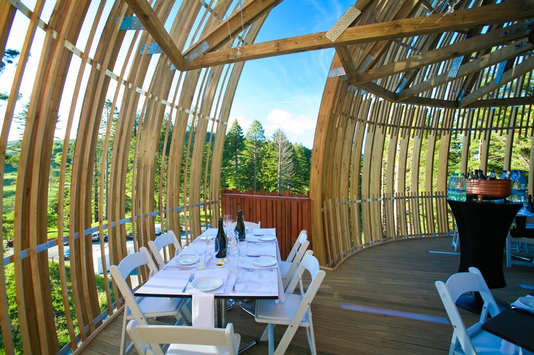
Project: Yellow Treehouse Restaurant
Architect: Pacific Environment Architects
Location: Auckland, New Zealand
Completion Date: December 2008

If this isn't the best advertisement in all time I don't know what is. The idea of this treehouse project started as an advertisement for Yellow Pages. Now this is a company that print out billions of phonebook directories around the world annually, with each book containing hundreds of pages, despite the fact that more and more people are starting to use online phone directories. You wouldn't really call it eco-friendly, would you? So I guess that is the reason behind this advertisement, to enhance their image in a modern society that is obsessed with the sustainability trend.

The idea behind this "reality" TV advert, as you can see from the youtube video link and their website, is to prove that whatever you want to do, you can do it relying solely on yellow! To make it challenging, the chosen project was: "A restaurant. 10 metres up a redwood tree."

All products and services were sourced through Yellow Pages listings (the book, online and mobile) to build this treehouse restaurant on an enormous Redwood Tree which is over 40m high and 1.7 diameter at the base.

The tree-house concept is reminiscent of childhood dreams and playtime, fairy stories of enchantment and imagination . It’s inspired through many forms found in nature -the chrysalis/cocoon protecting the emerging butterfly/moth, perhaps an onion/garlic clove form hung out to dry. It is also seen as a lantern, a beacon at night that simply glows yet during the day it might be a semi camouflaged growth, or a tree fort that provides an outlook and that offers refuge.The plan form also has loose similarities to a sea shell with the open ends spiralling to the centre.

The selected site and tree had to meet a myriad of functional requirements -18 seated people and waiting staff in relative comfort complete with a bar; gaining correct camera angles with associated light qualities for filming the adverts, web cam and stills, have unobstructed views into the valley and entrance to the site and structural soundness . The final selected tree is one of the larger trees on the site and sits above a steep part of the site which accentuates the tree’s height. Kitchen/catering facilities and toilets are at ground level.

The Architectural component embodies a simple oval form wrapped ‘organically’ around the trunk and structurally tied at top and bottom, with a circular plan that is split apart on the axis with the rear floor portion raised. This allows the approach from the rear via a playful tree-top walkway experience, slipping inside the exposed face of the pod and being enchanted by the juxtaposition of being in an enclosed space that is also quite ‘open’ and permeable to the treetop views. There is also a ‘Juliet’ deck opposite the entrance that looks down the valley.

The construction of this amazing project took 66 days only! The restaurant is located on a private land, so the consent granted for this project was to permit diners onto the site only. Unfortunate for the sightseers who were just fancying a glimpse of this wonder. So for those who are interested in visiting this building, you will have to book in advance to dine there for an unforgettable experience.

More info and pics can be found here

Wednesday, 25 November 2009

MATSYS

An intriguing BLDGBLOG post pushed me to look up some of the works of San Fransisco based design studio Matsys.

The design studio "explores the emergent relationships between architecture, engineering, biology, and computation" in addition to investigating "methodologies of performative integration through geometric and material differentiation."

As part of his MA dissertation in Emergent Technologies and Design at the Architectural Association, Andrew Kudless, an architect and founder of Matsys, researched a "honeycomb system that is able to adapt to diverse performance requirements through the modulation of the system’s inherent geometric and material parameters", which then can be industrially produced for use in architectural applications. You can see this clearly in his works Honeycomb Morphologies, Sature Chair and C_Wall.


Honeycomb Morphologies, 2004.


Suture Chair, 2005.


C_Wall, 2006.


P_Wall, 2009.


My fascination with Matsys' work might have something to do with the fact that I am always captivated by anything related to light filtration. However, it is the above P_Wall project that I really admire, which takes a different direction from the light filtering cellular structures above it. (I am sure I have posted something about it earlier but can't find the post!)

The two materials that are experimented with here are plaster and elastic fabric, to produce evocative visual and acoustic effects. It is "inspired by the work of the Spanish architect Miguel Fisac and his experiments with flexible concrete framework in the 1960-70s". An earlier version of this (P_Wall) is first exhibited in Banvard Gallery, Knowlton School of Architecture in Ohio at 2006. The picture above is of a commissioned version that is further developed and exhibited at The San Fransisco MOMA.

Next up is Sietch Nevada, a futuristic prototype project based on the "first planetary ecology novel" Dune. You can see this project as a continued development of the honeycomb and cellular structures experimentation. Or perhaps an application of those experimentation in architectural and urban planning. This prototype stems from the idea that water banking will be "the fundamental factor in future urban infrastructure in the American Southwest." Towns that once relied on "the promise of endless water via the powerful Colorado River... have increasingly begun to create underground water banks for use in emergency drought conditions" as droughts are becoming more frequent, possibly because of the heavy agricultural use and global warming.

The form of this urban prototype is derived from the performance of urban life based on storage, use and collection of water. "A network of storage canals is covered with undulating residential and commercial structures. These canals connect the city with vast aquifers deep underground and provide transportation as well as agricultural irrigation. Cellular in form, these structures constitute a new neighborhood typology that mediates between the subterranean urban network and the surface level activities of water harvesting, energy generation, and urban agriculture and aquaculture. However, the Sietch is also a bunker-like fortress preparing for the inevitable wars over water in the region."


Tuesday, 24 November 2009

Eid Spirit


As Eid is approaching, I would like to take this opportunity to say Eid Mubarak to you all. For this wonderful occasion, I thought I'd post this amazing painting by Ali Akbar Sahiwala, a friend and an architecture student that I believe one day will be among the "starchitects" that future generations will look up to.

I think Mecca has a unique spatial characteristic that is captured beautifully in this painting. As you can see from the painting above, and the aerial view below, taken by photographer AbdulRahman Roslan (I think), the white marbles that cover the floors and most of the walls, the white ihrams of pilgrims and the intense lighting system within the holy site illuminate this space adding to its grand status. Of course as a Muslim, I believe that there is a divine intervention that contribute to the captivating light within this holy site.